This post may contain affiliate links, meaning, at no additional cost to you, I may earn a commission if you click through and make a purchase
If you want to change your living space, the first thing that comes to mind is paint. Finding a new paint color can change the whole room in the hours it takes to dry. It sounds so easy.

My problem in our new house is paint color vs. light. I fully admit that I was swayed by all the good features of the house and ignored the light. The morning sun shines in the living room but doesn’t touch the dining room. There are no windows on the second the floor that let in the morning sun (see DYI List). My daughter’s room is almost always dark. Basically, paint is what going to make those rooms or break them.
In rehabbing an old house, there is a lot to paint. High ceilings, miles of trim around every window, doors, and wall and built-in, not to mention all the decorative and architectural elements that make the house so interesting. All have to be painted.
Room Theme
I live in an area that is cloudy and dark for about 8 months of the year. Dark colors are not a good choice, no matter how trendy. I’m not fond of the new grey trend either. We have nine months of dreary and grey winter skies, do I really want more grey? I am starting to warm up to them, though. Dark rooms can be cozy, but the wrong colors just make them seem closed in and depressing. The colors you choose for a room make create the atmosphere. Whether it’s informal or formal, airy or cozy, the paint is base for the theme you set in the room.
Natural light
The lack of light can also change the appearance of colors from room to room, depending on placement and type of windows. Natural light brings the under tone of a color. One color I chose appeared gold in one room and “baby-poop” in another. Light also brights the cold or warm base.
You home lights can also change the appearance of your room colors, depending on the type of bulb you are using. Personally, I’ve long resisted the switch to LED bulbs and lights simply because of the blue shade they cast on everything. I find that is makes the rooms look cold and feel cold.
Choosing Paint Colors – Undertones Matter
Full disclosure, I have a hard time picking colors. You would think an art teacher is better at this, but not in this case. Before we moved into the new house, the bedrooms needed to be painted. A previous owner had painted every piece of trim rusty brown (including twenty feet in the air!). However, it does go quite well with “Umbridge” Pink. Another previous owner then painted my daughter’s bedroom “dirty-cave grey”. Horrible and depressing. As someone who lives for the sunshine of summer, it made me cringe just walking into the room. However, after testing a new trim color, I discovered that that “dirty-cave grey” became a nicer purple-grey. Light brings out the base; colors that reflect light will bring out more of the base.
Choosing a color for the first floor has been particularly difficult. I wanted one unifying wall color for the living room, dining room, and front hall. One color that has a warm base, brightens darker corners and keeps the open areas cozy. This color has to also pair with miles of trim, a staircase of undetermined wood and wainscoting in the dining room. The color I chose was Buttermilk (Valspar). It’s bright and warm and creamy.
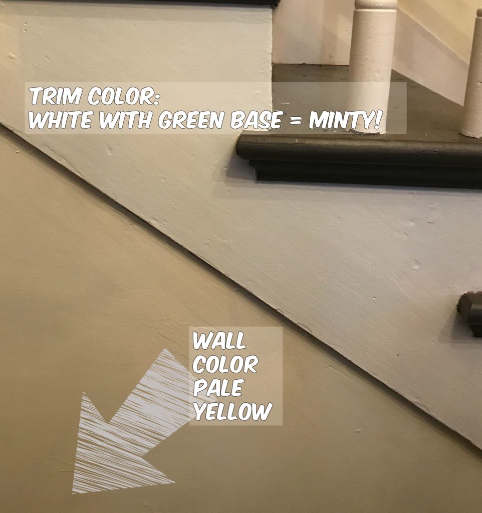
Unfortunately, it’s not working with the bright white trim. Or maybe it’s the brown stair steps. I’m not sure, but I’m not painting the stair treads at this point. My first choice for the trim was a very pale olive green. It turned to look “minty”. I’m not sure where the blue undertone came from because there wasn’t any in the swatch. But it was a total fail.

My next option was a neutral white with a yellow base. Matching base colors is a MUST to coordinate colors. It looks better, but I’m not completely satisfied. It might be the stair steps throwing me off. They’ve been painted a color that is probably a chocolate brown, but it’s just ugly. I have no idea what the previous owners were thinking with this brown.

Suggestions? I’ve tried the Valspar painter app and others, but these online coloring tools don’t seem to be working very well for me.

Tips for choosing a Paint Color:
- Decide on a warm base or cool base and make sure that your choices stay in that base.
- Staying within the same tones of a particular color can create a soothing or relaxing atmosphere.
- Look at the entire tone of the color chosen. If the darkest shade is one you like, then you will most likely like the lighter tints.
- Check Houzz.com to find inspiration photos. Usually, they include the names of paint color and brands, so that you can replicate.
- Gather ideas from Pinterest. There are tons of bloggers with awesome design abilities. Remember that the photos may be staged with extra lighting.
- Take photos and share with friends or invite friends with great style over to your house
- Ask friends for ideas! Post photos on Facebook with options and create a poll.
- Get lots of testers. For $5, your paint store will make up a sample of the color in semi-gloss.
- Make friends with someone also painting their home. A friend gave me all of her testers after they finally settled on a color. They live across the street, so they have the similar lighting issues.


One thought on “Choosing Paint Color for a Farm House”